
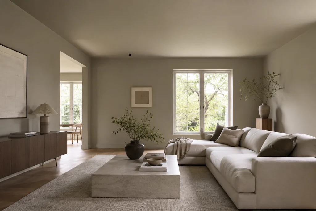
Should I Paint My Ceiling the Same Colour as My Walls?
Yes, in many cases you absolutely should. Painting your ceiling the same colour as your walls is one of the most effective decorating decisions you can make in the right room, and it produces results that a white ceiling simply cannot. That said, it does not work universally. Understanding when it works brilliantly and when it falls flat saves you time, money, and a repaint.
The idea of matching the ceiling to the walls makes people nervous. Decades of magnolia ceilings and bright white woodwork have conditioned most homeowners to see the ceiling as a neutral zone, something to keep pale and leave alone. Interior design has moved well beyond that thinking, and the results speak for themselves.
When Matching Ceiling to Walls Works Exceptionally Well
The strongest case for painting your ceiling the same colour as your walls is rooms where you want to create atmosphere and enclosure. Dark, rich colours behave completely differently in a ceiling-matched room compared to a room with a white ceiling above the same wall colour.
Take a deep forest green, a dark inky navy, or a warm terracotta. Apply it to the walls and leave the ceiling white, and the room feels like a box with a lid. Apply it to all five surfaces, including the ceiling, and the room becomes immersive. The colour wraps around you. The boundaries of the room dissolve slightly, and the space feels designed rather than simply painted.
This effect works particularly well in dining rooms, home studies, snugs, and bedrooms. These are rooms where intimacy is an asset. You want them to feel contained and considered. A matched ceiling achieves this far more effectively than any white alternative.
The Effect on Ceiling Height
This is the concern that stops most people. Will painting the ceiling the same dark colour make the room feel lower? The honest answer is yes, it will lower the perceived ceiling height. Whether that matters depends entirely on your room.
In a period property with high ceilings of three metres or above, bringing the ceiling down visually is often exactly what the room needs. Tall, narrow rooms with white ceilings can feel cold, ecclesiastical, and hard to furnish comfortably. A ceiling painted to match the walls pulls the room into better proportion and makes it feel genuinely livable.
In a modern new-build with standard 2.4 metre ceilings, the calculation changes. Painting a ceiling in a mid-tone or dark colour in an already low-ceilinged room will make it feel noticeably more compressed. In these situations, consider using a slightly lighter version of the same wall colour on the ceiling. It’s better than using an exact match. This keeps the tonal harmony without the visual compression.
Using a Lighter Tone on the Ceiling
This is a technique worth knowing. Rather than an exact colour match between wall and ceiling, some designers prefer to use the wall colour at half or quarter strength on the ceiling. Paint manufacturers can mix this for you.
The result is a ceiling that clearly belongs to the same colour family as the walls without duplicating them exactly. The room still feels cohesive and wrapped, but the ceiling reads as slightly separate, which preserves a sense of height. This approach works particularly well with mid-tone colours like dusty blues, sage greens, warm taupes, and terracottas, where the full-strength version on the ceiling might feel overwhelming.
When a White Ceiling Is Still the Right Choice
There are genuine situations where a white ceiling outperforms a matched ceiling.
Rooms with very limited natural light are riskier candidates for ceiling colour. Natural light bounces off white ceilings. It distributes itself around the room. A dark or saturated ceiling absorbs that light rather than reflecting it, which can make a north-facing or basement room feel genuinely gloomy. In these situations, keep the ceiling pale and focus your colour on the walls only.
Open-plan spaces present their own challenges. A matched ceiling in an open-plan kitchen, dining, and living area can feel relentless because there is no visual break across a large expanse. White or very pale ceilings in open-plan spaces allow each zone to breathe and prevent the colour from dominating at the expense of everything else.
Very small rooms, such as downstairs cloakrooms and compact hallways, can go either way. Some designers lean fully into the enclosure and paint every surface, including the ceiling, in the same deep tone, creating a jewel-box effect that feels intentional and luxurious. Others prefer to keep the ceiling white to prevent these small spaces from feeling claustrophobic. The right answer depends on the specific room and your own tolerance for enclosure.
The Impact on Woodwork and Trim
Once you decide to match the ceiling to the walls, you face a secondary decision about your woodwork. Skirting boards, architraves, cornicing, and door frames all need a considered response.
The most popular approach in contemporary interiors is to paint woodwork in the same colour as the walls and ceiling, or in a closely related tone. This creates full colour immersion and makes architectural details recede, giving the room a smooth, continuous feel. It works especially well in rooms with simple, modern profiles on the skirting and architraves.
In period properties with ornate cornicing, ceiling roses, and detailed architraves, you face a choice between highlighting those features in white or cream or allowing them to dissolve into the wall colour. Both approaches work, but they produce very different results. White-painted cornicing on a coloured ceiling frames the architecture and draws the eye upward. Colour-matched cornicing makes the room feel seamless and modern, regardless of the building’s age.
Finish Matters as Much as Colour
Most people know to use matt emulsion on ceilings because it minimises the appearance of imperfections in the plasterwork. This holds true whether your ceiling is white or coloured. A silk or eggshell finish on a ceiling catches raking light. It highlights every undulation and brush mark. Matt finishes absorbing light, making the ceiling look flat and clean.
If you are painting walls and ceiling in the same colour, consider using the same matt emulsion on both surfaces for a truly seamless look. Using a different finish on the ceiling, even in the same colour, creates a subtle but perceptible difference that slightly undermines the effect.
Colours That Work Particularly Well on Ceilings
Certain colours make an especially strong case for ceiling application.
Deep navy and midnight blue on a ceiling creates a sky-at-night effect that works beautifully in bedrooms. Pair it with warm brass lighting and pale linen bedding for a room that feels expensive without requiring expensive materials.
Warm terracotta and clay tones on a ceiling add a Mediterranean warmth that transforms dining rooms and kitchens. These earthy tones feel natural overhead in a way that cooler colours sometimes do not.
Soft sage and muted olive greens feel genuinely organic on a ceiling, particularly in rooms with natural materials, wood tones, and plenty of houseplants. These colours nod to the outdoors without demanding much contrast from the rest of the room.
Charcoal and off-black on a ceiling is a bold choice. It pays off in rooms used primarily in the evening. A charcoal ceiling in a dining room lit entirely by candlelight and warm pendant lamps is one of the most atmospheric interiors you can create without any structural work at all.
Getting the Edges Right
The practical question of where the wall colour ends and the ceiling begins matters more when both surfaces share the same colour. With a white ceiling, a slightly imperfect cut-in line is forgivable because the contrast hides minor wobbles. With a matched ceiling, the line between wall and ceiling disappears entirely. This means small imperfections in your cutting-in technique become irrelevant. This is actually one of the lesser-known advantages of matching the ceiling to the walls. The pressure to achieve a perfect line vanishes when both sides of that line are identical.
If you have cornicing, the decision about where to stop the colour is more nuanced. You can bring the wall colour up to the bottom of the cornice and paint the cornice separately, take the wall colour over the cornice and onto the ceiling in one continuous sweep, or use the cornice as a natural break and paint the ceiling in a related but lighter tone. All three approaches produce clean, intentional results when executed carefully.
The bottom line is straightforward. If the room has good ceiling height, the colour suits the room’s function, and if you want atmosphere over airiness, paint the ceiling to match. It is one of the simplest ways to make a room feel genuinely designed rather than simply decorated.
