
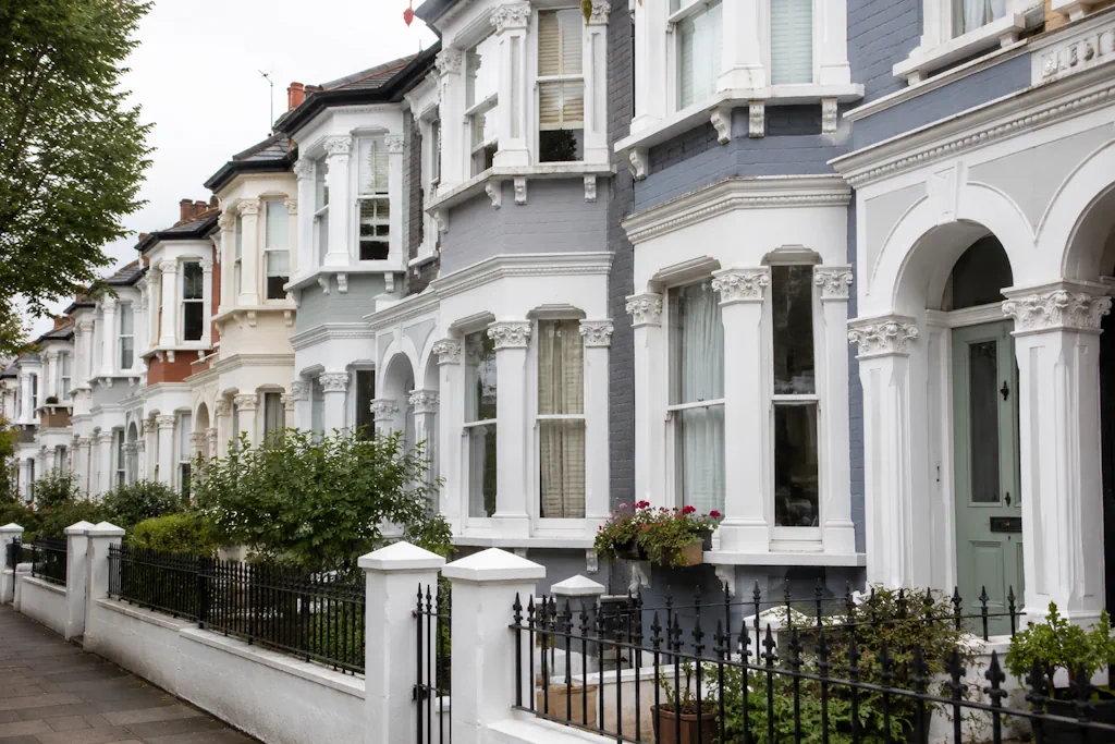
Best Paint Colours for Victorian Terraced Houses in West London
Victorian terraces have good bones. Tall sash windows, decorative brickwork, stucco detailing on the front elevation, and proportions that were built to look right from the street. The wrong colour scheme flattens all of that. The right one brings it forward. Streets across Chiswick, Ealing, Richmond, and Hounslow are full of these houses, and the ones that stand out usually got their colour choices right rather than being expensive.
Understanding What You’re Working With
Most Victorian terraces in West London share a similar structure. A stucco-rendered ground floor, often with a bay window, sits below plain brick upper storeys. Window frames, door surrounds, and any decorative mouldings sit on top of that. Each of these elements can receive different treatment, and getting the balance right among them matters more than picking one “correct” colour.
Original Victorian schemes leaned on off-whites, stone shades, and muted greens or blues for woodwork. Later decades introduced heavier use of magnolia and cream across entire facades, which flattened a lot of period detail. The better modern approach borrows from the original palette but applies it with more contrast and confidence.
Stucco and Render: Where to Start
The ground floor render is usually the largest surface on the front of the house, so it sets the tone for everything else. Soft off-whites still work well here, particularly warm shades rather than stark brilliant white, which can look harsh against London brick and grey skies. Farrow & Ball’s Off-White, Pointing, or Strong White all suit this kind of facade.
Pale greys have become popular too, and they photograph well, but they need checking against your actual brickwork and the light on your specific street before committing. A grey that looks right in a paint app can read cold and flat once it’s up against London brick in overcast weather, which is most days.
Brickwork: Leave It or Paint It?
Original London stock brick has a lot of character, and most period specialists would leave it unpainted where it’s in good condition. Repointing and a clean often solve more problems than paint ever will. Painted brick can look sharp when it’s done properly, in a soft off-white or pale grey, but it’s close to permanent. Once a brick is painted, going back to bare brick again is a serious job, so it’s worth thinking that through before deciding.
Window Frames and Sashes
This is where colour has the most impact for the least cost. Traditional Victorian schemes used dark colours here: deep greens like Farrow & Ball’s Studio Green or Duck Green, near-black shades such as Off-Black, or a strong navy. These dark tones frame the glass and give the whole front elevation a crisper, more considered look against a pale render.
White or cream frames work too, particularly on houses with heavier stucco detailing where a dark frame would compete with the mouldings rather than complement them. The choice depends on how much detail your particular house already carries.
Front Doors: The Detail Worth Getting Right
A front door is a small surface. It’s a disproportionate amount of influence on how the whole house looks from the street. Deep colours perform best here: bottle green, oxblood, navy, or a near-black charcoal. These tones read as classic rather than trend-led, and they hold up better than pastel shades against London’s grime and pollution levels.
Brass or black ironmongery both work against dark doors, so this is a good place to match hardware to whatever period features the house still has, rather than defaulting to whatever came with the door.
Getting Approval Right First
A good number of these terraces sit in conservation areas, particularly around Ealing, Chiswick, and parts of Richmond. Conservation area rules can restrict colour choices on front elevations, sometimes strictly. Check with the local council before committing to anything unusual on a front-facing wall. It saves a repaint and, in some cases, an enforcement notice.
Pulling the Scheme Together
The strongest Victorian terrace schemes keep the render pale, use one confident dark tone across windows and doors, and leave brickwork alone wherever it’s sound. Simple, high-contrast, and true to the period, rather than trying to reinvent a house that was already designed well the first time.
If you’re planning an exterior repaint and want help choosing a scheme that suits your specific house and street, get in touch for advice on what will work best.
