
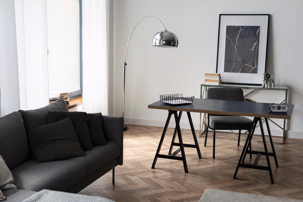
What Colour Works Best in Dark Rooms?
Dark rooms pose a unique challenge for decorating. Limited natural light can make walls feel cramped, ceilings low, and spaces uninviting. The right paint colour transforms these rooms, reflecting light, creating depth, and enhancing mood. A professional painter and decorator combines colour choice with finish, technique, and placement to bring balance to low-light interiors.
Light Neutrals Brighten and Open Spaces
Soft whites, creams, and pale beiges are ideal for dark rooms. They reflect the most light, instantly opening up corners and lifting ceilings. Warm neutrals like ivory or light sand add a cosy feel without reducing brightness. Cool whites with a hint of grey can create a crisp, modern atmosphere. Professionals often use warm or cool undertones strategically, matching furniture, flooring, and lighting to maximise the effect.
Pastels Add Subtle Colour Without Closing In
Pale pastels such as mint green, blush pink, or powder blue introduce colour while keeping rooms bright. Pastels soften harsh shadows and make artificial lighting feel warmer. A professional painter applies these shades in multiple coats, ensuring even coverage and smooth transitions. Subtle colour on all walls helps maintain an airy atmosphere, while accent trims can contrast without overpowering the space.
Soft Greys for Modern Elegance
Light and medium greys work well in rooms with minimal sunlight. Grey reflects light differently depending on the undertone, making it versatile. Cool greys create a calm, spacious feel, while warmer greys add depth and sophistication. Professionals often recommend combining grey walls with white or off-white ceilings and trims, which prevents the space from feeling flat or gloomy.
Bright Accent Walls for Dimension
Introducing one accent wall in a soft but vivid colour can lift a dark room without overwhelming it. Shades like soft teal, muted mustard, or dusty rose add character and draw the eye. The painter carefully balances accent walls with surrounding neutrals to maintain openness. Correct placement near natural light sources enhances the effect and prevents shadow-heavy corners.
High-Reflective Finishes
Colour alone isn’t enough. Satin or eggshell finishes bounce light across the room, reducing shadows. Matt finishes absorbing light and can make dark rooms feel smaller. Professionals apply these finishes to walls and ceilings. Trims and woodwork often receive semi-gloss or gloss paint, reflecting light and framing the space cleanly.
Strategic Ceiling and Trim Colour
Ceilings should always be lighter than the walls in dark rooms. Even a subtle off-white lifts the height visually. Skirting boards and architraves in a slightly lighter shade than the walls create definition while preventing the room from feeling boxed in. Professional decorators consider natural and artificial lighting before finalising ceiling and trim shades.
Layering Colour with Textiles and Accessories
Even the best paint works with furnishings. Light-coloured curtains, rugs, and cushions enhance wall colour and amplify light reflection. Professionals often suggest coordinating soft tones throughout the room to create a cohesive, expansive look. Mirrors and metallic accents further increase perceived brightness, especially when paired with reflective paint finishes.
Final Thoughts
The best colour in dark rooms combines light-reflecting shades, soft pastels, and strategic accents. Neutrals, pale tones, and subtle grey create space and depth. Finish, ceiling colour, and trims all contribute. A skilled painter and decorator ensures every surface maximises light, maintains balance, and produces a warm, inviting, and visually spacious room.
